Want to learn how to build cool stuff online?
Data Visualization may be for you
Data Visualization (JRNL 3165) is a quantitative course open to all third- and fourth-year students at Kwantlen. There are no pre-requisites other than already having 45 credits under your belt.
Taught by award-winning data journalist Chad Skelton, Data Visualization (JRNL 3165) will teach you how to turn raw data — sales data, crime data, research data — into compelling interactive maps and charts.
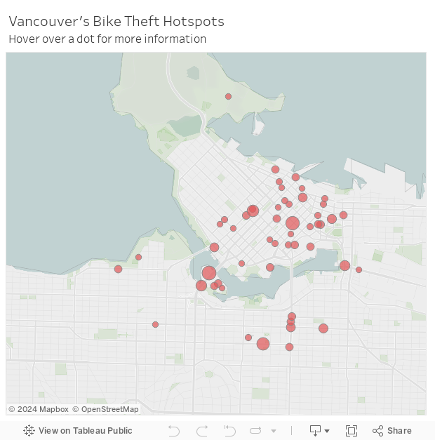
For example, let's say you've got some information on all the bike thefts that happened in the City of Vancouver over the past few years. You'll learn how to turn that into an interactive map like this one:
Or maybe you've got some election results and you want to let people drill-down to see the vote breakdown in their riding. You'll learn how to turn that data into something like this:
In addition to teaching you how to make cool online tools, Data Visualization (JRNL 3165) will teach you the fundamentals of data analysis in Excel, so you can figure out what's really going on with your data. And it will walk you through how to find the data you need on open-data portals and Statistics Canada's website.
Data Visualization (JRNL 3165) doesn't require you to learn any programming or HTML code. Instead, everything you learn how to do will be done using free data visualization tools like Datawrapper and Tableau Public.
Data analysis and visualization skills are in huge demand these days, from fields as diverse as journalism, business and policing. Data Visualization (JRNL 3165) will teach you the basics of how to understand your data and how to display it in a way that gets your point across to your audience.
For more information, feel free to drop Chad Skelton a line at chad.skelton@kpu.ca.